Return to CreateDebate.comsnappys • Join this debate community

CreateDebate Snappy Awards


Debate Info

4
16
Design #1 Design #2
Debate Score:20
Arguments:19
Total Votes:20
More Stats

Argument Ratio

side graph
 
 Design #1 (4)
 
 Design #2 (15)

Debate Creator

addltd(5144) pic


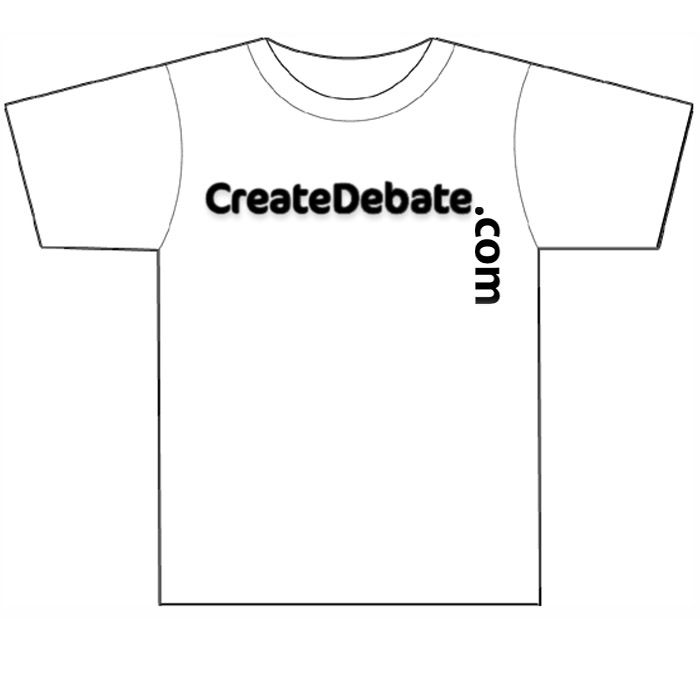
2012 Snappys Winners T-Shirt Question #1 - Logo

This Design - Thanks to Joe Cavalry
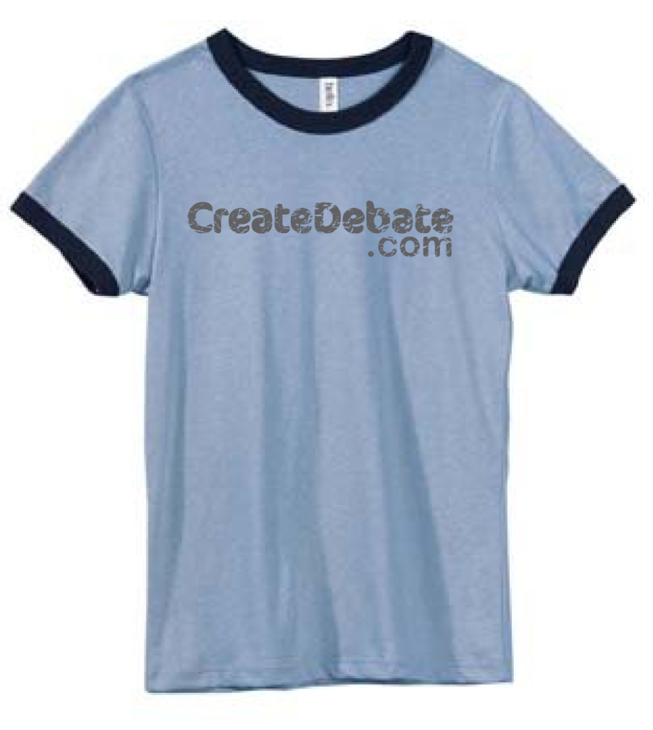
 

OR...Design #2

QUESTION #2 - What shirt color? http://snappys.createdebate.com/debate/show/2012_Snappys_Winners_T_Shirt_Question_1_Shirt_Color

Design #1

Side Score: 4
VS.

Design #2

Side Score: 16
1 point

Well, I don't like the font for the second one. Either way, I don't really mind.

But i prefer this one.

Side: Design #1
1 point

First is better, IMO, what with the ".com" changing direction.

Side: Design #1
1 point

The first one is kind of cool. They're both okay, I like this one better though.

Side: Design #1

Altough design one is losing, I just like the.com at the vertical angle.

Side: Design #1

I see no reason to rotate the '.com' by 90 degrees. I therefore prefer this design.

Side: Design #2
1 point

I would like design number 2 please! I don't really like the other one. T

Side: Design #2
1 point

My vote .

Side: Design #2

Second design with the font from #1 (lose the grunge effect, and it'd be great).

Side: Design #2

It seems like the manufacturer already has a setup for this design so no need to change it. Plus currently there are more people on this side and I don't want to create any waves. ;)

Side: Design #2
1 point

I like this one, but maybe add a big gavel underneath it or another graphic, to give it flair.

#1 is a bit awkward looking.

Side: Design #2
1 point

I prefer this one over here. Sorry Joe ;)

Side: Design #2

Design 2 .

Side: Design #2

I prefer this one.

Side: Design #2
1 point

It simply looks better. People would look better walking around in it!

Side: Design #2

My vote is for this one .

Side: Design #2

I really like both, but this one has my vote

Thanks for the options of choice.

Side: Design #2

Try to make them a different color each year because same would be boring.

Side: Design #2
1 point

I like this one the best also.

Side: Design #2

This one but make the font of ".com" be really fancy cursive. Also the shirt should be black with orange outline on the ends of the sleeves and collar with blue lettering outlines in orange. Swag...

Side: Design #2